In this article, we will discuss the React Styled-Components how you can use the React Styled components in your React project, and understand the benefits of using styled components.
Over the past few years react gained immense popularity for creating visually appealing and responsive user interfaces so let’s start this React styled-components tutorial.
What are the React Styled Components?
React Styled components represent a modern approach to styling React applications, allowing developers to write CSS directly within their component code. This not only simplifies the styling but also offers the flexibility of dynamic styling based on component props.
When you have a large react application it is difficult to manage styling for the whole project the Styled components address this problem by adding styles within the components, providing a maintainable solution.
Setting Up Your React Project with Styled-Components
Before diving into the React Styled Components, ensure that your React project is set up correctly. To use styled-components first install the same using the below command –
Installing React Styled-Components
npm install styled-components
Now the styled-components have been set up in your project, let’s start with some basic styling using styled components.
In your React application, you need to import styled components in your App.js file like the below –
// App.js

import './App.css';
import styled from 'styled-components';

function App() {
return (
<div>
<h1>Title</h1>
<p>Lorem ipsum dolor sit amet, consectetuer adipiscing elit. Aenean commodo ligula eget dolor.</p>
<button>Click Here</button>
</div>

);
}
export default App;
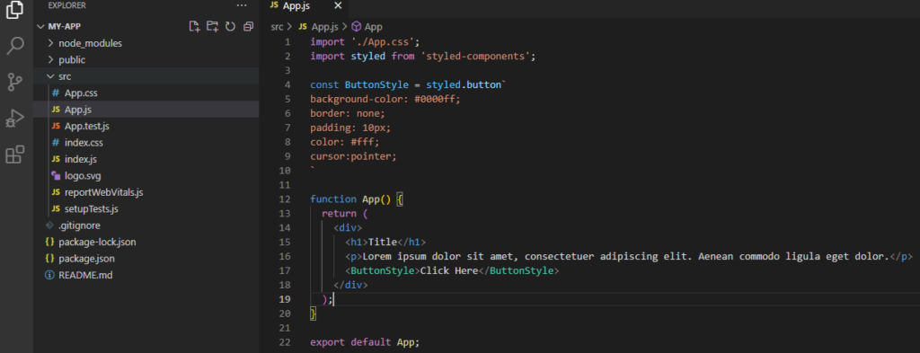
Now if I have to apply some styling in my button element using the styled component then first create our custom component called “ButtonStyle” and use it instead of the <button> tag with custom styling after that we’ll start with styled.<HTML Tag Name> and wrap the style in backticks.
const ButtonStyle = styled.button`
background-color: #0000ff;
border: none;
padding: 10px;
color: #fff;

`
Now when we use this custom component it will have the <HTML Tag Name> i.e. “ButtonStyle” property with styling.
import './App.css';
import styled from 'styled-components';

const ButtonStyle = styled.button`
background-color: #0000ff;
border: none;
padding: 10px;
color: #fff;
`
function App() {
return (
<div>
<h1>Title</h1>
<p>Lorem ipsum dolor sit amet, consectetuer adipiscing elit. Aenean commodo ligula eget dolor. </p>
<ButtonStyle >Click Here </ButtonStyle>
</div>
);

}

export default App;
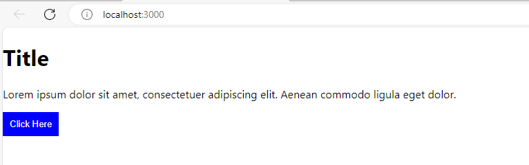
Save and run the app and see the changes the button style was updated and below is the output –
Note – One point to remember here is always to use the Upper letter to start your custom component name as it’s a react naming convention.
Suppose you have multiple buttons on your app now use the same style for all your buttons this is how use can apply basic styling in your HTML element using React Styled-Components.
Benefits of using React Styled-Components
- Component-Level Styles: Each component has its styles, reducing the risk of style conflicts in large React applications.
- Dynamic Styling: The ability to use JavaScript within styles allows for dynamic styling based on component props. This enables developers to create a more flexible UI, where styles can change dynamically in response to different states or conditions.
- Theming: Easy implementation of theming for a consistent design across the React application.
- Responsive Design: Media queries CSS and responsive design can be easily implemented using React Styled Components. This allows developers to create components that work on any device like a laptop, tabs, or mobile devices.
- Global Styles Control: React Styled-Components supports global styles, such as font family, font sizes, and body background colors, which can be controlled efficiently using the “createGlobalStyle” utility provided by Styled-Components. This ensures consistent styling across the entire React application.
The styled component has a lot of other things as well like – Nested styles, Themes, Animation, etc.
Conclusion
This is how you can use the React Styled Components and take the benefits of styled components in your React application. I hope now you can implement styling using the styled components.