In this article, we will discuss how you can implement micro-animation in React using its libraries. Modern web development now includes micro-animations which are the small yet powerful effects inside a user interface.

Using the power of micro-animations in React applications may greatly increase user engagement and offer an interactive user experience.
With Micro animation, you can create animation for form validation, animate navigation elements, and animate controls on form.
Benefits of Micro-Animations in React
- Improving Interaction with Users
User attention is largely captured by micro-animations. By offering visual signals, they help users navigate the UI and improve the simplicity of interactions.
- Effectively Communicating Feedback
Micro-animations provide fast feedback in situations such as form submissions or incorrect validations, which minimizes confusion and enhances the user experience in general.
Implementing Micro-Animation in React
Selecting an appropriate react animation library is key to successful implementation. React Spring, Framer Motion, and Anime.js for React are popular choices, each offering unique features for creating micro-animations for React App.
Apart from these popular libraries using the React Styled-Components developers can create micro animation. Below is an example where we are going to create a button that, when hovered over, slightly changes, offering a fun little interaction.
Example –
// Import React and necessary styles
import React from 'react';
import styled from 'styled-components';

const DivParent = styled.div`
padding:30px; `;
// Styled component for the button
const AnimatedButton = styled.button`
background-color: #3498db;
color: #fff;
padding: 10px 20px;
font-size: 16px;
border: none;
cursor: pointer;
transition: transform 0.2s ease-in-out;

&:hover {
transform: scale(1.1);
}
`;

// React component using the animated button

const MicroAnimationExample = () => {

return (
<DivParent>
<p>Hover over the button to see the micro-animation:</p>
<AnimatedButton> Click me </AnimatedButton>
</DivParent>
);
};
export default MicroAnimationExample;
- We use the styled-components library to create a styled button component called AnimatedButton.
- The button has a default style with a background color, padding, and other properties.
- We define a transition property, specifying that the transform property should have a smooth transition over 0.2 seconds.
- On :hover, the button’s transform property is adjusted to scale(1.1), making it slightly larger and creating a subtle scaling effect.
Output –
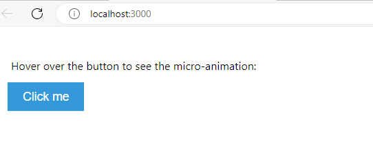
Try it yourself and see the animation when you hover on the button. This is how you can animate your HTML control using the React Styled Components.
Popular React Animation Libraries
Install the Required packages to use the below micro-animation libraries in React.
- React Spring
React Spring offers a straightforward and adaptable solution for integrating physics-based animations into React apps. Because of its low weight, it’s perfect for micro-animations.
- Frame Motion
Because of its declarative syntax, Framer Motion is well-known for making complicated animations simple to develop. A variety of controls are provided to enable accurate micro-interactions.
- Anime.js for React
React can be easily combined with the flexible animation toolkit Anime.js. Fine-grained control over animation settings is possible because of its API.
Animate Using React Spring
Smooth and efficient animations may be easily created with React Spring, a well-liked animation framework for React. Let’s develop an example of a micro-animation with a small fade-in effect for a component’s arrival using React Spring.
Let’s first install the React Spring Library using the below command –
npm install react-spring
Example –
Paragraph Text fade-in effect
// Import React, useState, and the necessary components from React Spring

import React from 'react';
import { useSpring, animated } from 'react-spring';
// React component using React Spring for a fade-in effect

const FadeInAnimation = () => {
// Define the animation configuration using useSpring
const fadeIn = useSpring({ opacity: 1, from: { opacity: 0 },
config: { duration: 500 },
// Adjust the duration as needed
});
return (
<animated.div style={fadeIn}>
<div> <p>This component has a fade-in effect using React Spring:</p>
<p>Additional content test...</p> </div>
</animated.div>
);

};

export default FadeInAnimation;
In this example:
- We use the useSpring hook from React Spring to define the animation configuration.
- The opacity property is animated from 0 (initial state) to 1 (final state), creating a fade-in effect.
- The config property allows you to customize the animation duration and other parameters.
You can increase the config value to see the noticeable visual effect.
Conclusion
This is how you can implement micro-animation in React using the animation libraries. I hope now you able to create micro-animated components with the help of React animation libraries.