In this article, We will discuss how to implement React dropdown how to improve React dropdown UX and what are the different benefits of using React dropdowns.

As you know a dropdown is fundamental control and it has been used in all the applications. A well-designed dropdown should not only look good but also enhance overall application design so Let’s implement React Dropdowns.
Understanding React dropdown
Dropdowns are interactive controls that allow you to select from a list of options and integrate them into your React app but achieving a positive UX requires additional attention.
Different libraries can be used for styling and animation in React dropdowns.
How to implement React Dropdowns
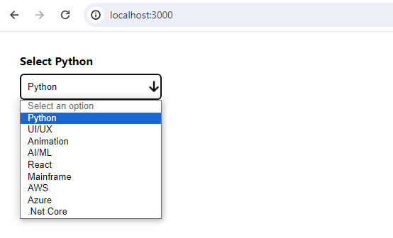
Let’s create a dropdown component in the React app to handle different courses.
import React, { useState } from 'react';
import './Courses.css'; // Import the styling

const CoursesDropdown = () => {
const [selectedOption, setSelectedOption] = useState(null);
const options = ['Python', 'UI/UX', 'Animation', 'AI/ML', 'React', 'Mainframe', 'AWS', 'Azure', '.Net Core']; // Replace with actual options

return (
<div className="product-dropdown">
<label>Select {selectedOption || 'Option'}</label>
<select
onChange={(e) => setSelectedOption(e.target.value)}
value={selectedOption || ''}>
<option value="" disabled>Select an option</option>
{options.map((option) => (
<option key={option} value={option}>
{option}
</option>
))}
</select>
</div>
);
};

export default CoursesDropdown;
I have imported one Courses.css file and one arrow-down.png image file which has been used for styling for my dropdown.
Courses.css
/* CoursesDropdown.css */

.courses-dropdown {
margin-bottom: 20px;
width: 200px;
padding: 30px;
}

.courses-dropdown label {
display: block;
margin-bottom: 8px;
font-weight: bold;
}

.courses-dropdown select {
width: 100%;
padding: 10px;
border: 1px solid #ccc;
border-radius: 5px;
cursor: pointer;
}

.courses-dropdown select:hover {
border-color: #555;
}

.courses-dropdown select {
width: 100%;
padding: 10px;
border: 1px solid #ccc;
border-radius: 5px;
cursor: pointer;
max-height: 150px; /* Set a fixed height for the dropdown */
overflow-y: auto; /* Enable vertical scrolling for long lists */
}

@media only screen and (max-width: 600px) {
.courses-dropdown select {
max-width: 100%;
}
}

.courses-dropdown select {
-webkit-appearance: none;
-moz-appearance: none;
appearance: none;
padding-right: 30px;
background: url('./arrow-down.PNG') no-repeat right center / 20px; /* Replace with your arrow icon */
}
Now the dropdown will look like below –
Dealing with Long Lists or Searchable Dropdowns in the React
How i can create a dropdown that can handle a large number of items? The dropdown should be searchable and you have to show a vertical scroll after a certain height.
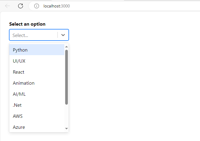
To implement searchable and custom styling for long lists you might need to consider a third-party library like “react-select”. Here’s an example of how you can use the same –
First, install the Library –
npm install react-select
Then use the same in your dropdown component –
import React from 'react';
import Select from 'react-select';
import './Courses.css';

const CoursesDropdown = () => {
  const options = [
    { value: 'Python', label: 'Python' },
    { value: 'UI/UX', label: 'UI/UX' },
    { value: 'React', label: 'React' },
    { value: 'Animation', label: 'Animation' },
    { value: 'AI/ML', label: 'AI/ML' },
    { value: '.Net', label: '.Net' },
    { value: 'AWS', label: 'AWS' },
    { value: 'Azure', label: 'Azure' },
    { value: 'SQL', label: 'SQL' },
    { value: 'Mongo DB', label: 'Mongo DB' },
    { value: 'Java', label: 'Java' }
    // Add more options as needed
  ];

  return (
    <div className="courses-dropdown">
      <label>Select an option</label>
      <Select options={options} isSearchable={true} />
    </div>
  );
};

export default CoursesDropdown;
Output
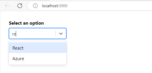
If type something in the dropdown you can search items from the existing items which is helpful when you have populated a large number of items in the dropdown. See below output –
In this example, react-select provides a more customizable dropdown that includes a vertical scroll, and further you can search the dropdown using the “issearchable” property. It’s a Boolean type property if true the dropdown is searchable else non-searchable.
The react-select property provides other options as well like – Multi-selection, creating Options along with Existing options, Styling, theming, etc. Using these options you can enhance the dropdown menu based on your requirements.
Benefits of React Dropdowns
1. Enhanced User Experience:
Users may choose more easily and with more engagement when customized designs and animations increase visual appearance.
2. Optimized Performance:
The Efficient handling of large datasets and lazy loading options contribute to faster load times and smoother user interaction.
3. Responsive Design:
A consistent and user-friendly experience across devices is ensured by customizing the dropdown menu for different screen sizes.
4. Searchable Options:
React provides a third-party library that can be used to search in the dropdown which enhances user convenience, especially when dealing with large lists of options.
5. Dynamic Data Binding:
Binding dropdown items dynamically to changing data allows for seamless updates without compromising performance.
Conclusion
This is how you can implement React dropdowns and proper styling you also learn what are the benefits of React dropdowns in web development.
I hope now you know how to implement React dropdowns.