In this article, Understand how you can create a tooltip in React and learn the art of enhancing user interfaces by Styling tooltip in React.

Before we apply styling to the tooltip let’s first understand what is tooltip.
What is Tooltip
Tooltips work as a user interface (UI) element that provides additional information or context when a user hovers over any element or control. Suppose you have a page with certain controls or icons, and if a user hovers over those controls or icons, the tooltip helps them to know more about them.
Let’s start with styling the tooltip in React.
Styling tooltip in React
Firstly, make sure you have installed the styled components using the below command –
npm install styled-components
Now, let’s create a Tooltip component with proper styling. Add one file in src and name the same in Tooltip.js now add the below code –
import React from 'react';
import styled from 'styled-components';

// Styled component for the Tooltip
const StyledTooltip = styled.div`
position: relative;
display: inline-block;

/* Tooltip content styling */
.tooltip-content {
visibility: hidden;
width: 120px;
background-color: #333;
color: #fff;
text-align: center;
border-radius: 5px;
padding: 5px;
position: absolute;
z-index: 1;
bottom: 125%;
left: 50%;
margin-left: -60px;
opacity: 0;
transition: opacity 0.3s;

/* Arrow styling */
&::after {
content: "";
position: absolute;
top: 100%;
left: 50%;
margin-left: -5px;
border-width: 5px;
border-style: solid;
border-color: #333 transparent transparent transparent;
}
}

/* Show the tooltip on hover */
&:hover .tooltip-content {
visibility: visible;
opacity: 1;
}
`;

// Functional component for the Tooltip
const Tooltip = ({ text, children }) => {
  return (
    <StyledTooltip>
      {children}
      <div className="tooltip-content">{text}</div>
    </StyledTooltip>
  );
};

export default Tooltip;
Now, you can import this Tooltip component into your App.js file. Here’s an example of how you can use it –
import React from 'react';
import Tooltip from './Tooltip'; // Adjust the import path based on your project structure
import styled from 'styled-components';
const Styledh1 = styled.h1`
padding:20px;
`;
const App = () => {
  return (
    <div>
      <Styledh1>Styling Tooltip in React Example</Styledh1>
      <Tooltip text="I'm a tooltip!">Hover me</Tooltip>
    </div>
  );
};

export default App;
Output –
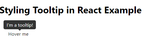
This is a simple example of how you create and stylish tooltip in your project. And if you don’t want to use React styled components you can create a stylish tooltip using custom CSS as well.
Let’s create one form and add a tooltip to that form control. In your App.js add below code –
import React from 'react';
import './App.css'; // Import your stylesheet for styling

const MyForm = () => {
  return (
    <div>
      <form>
        <div className="form-control" data-tip="Enter your full name">
          <label>Name:</label>
          <input type="text" name="name" />
        </div>

        <div className="form-control" data-tip="Enter your date of birth">
          <label>DOB:</label>
          <input type="date" name="dob" />
        </div>

        <div className="form-control" data-tip="Enter your phone number">
          <label>Phone Number:</label>
          <input type="tel" name="phoneNumber" />
        </div>
      </form>
    </div>
  );
};

export default MyForm;
Output –
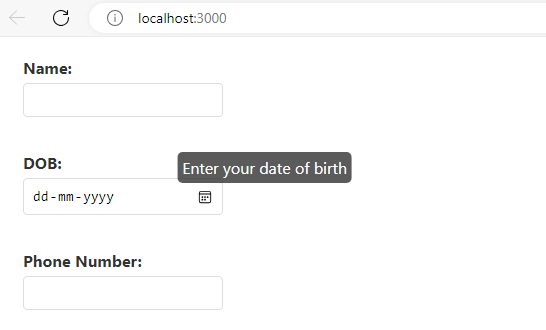
Note – Here I have used “data-tip” which is a custom attribute added to HTML elements and it stores additional data associated with an element. In this react form, the data-tip is used to store the text of the tooltip that should be displayed when the user hovers over the corresponding form control.
And App.css which I have imported at the top add below CSS for styling –
.form-control {
position: relative;
margin-bottom: 15px;
padding: 20px 30px 0 30px;

}

.form-control label {
display: block;
margin-bottom: 5px;
font-weight: bold;
color: #333;
}

.form-control input {
width: 200px;
padding: 8px;
box-sizing: border-box;
border: 1px solid #ddd;
border-radius: 4px;
font-size: 14px;
cursor: pointer;
}

.form-control:hover::before {
content: attr(data-tip);
position: absolute;
top: 20px;
left: 20%;
transform: translateX(-50%);
background-color: #333;
color: #fff;
padding: 5px;
border-radius: 5px;
white-space: nowrap;
opacity: 0.8;
z-index: 1;
}
Now run the react app using npm-start and check the tooltip on hover from any form control.

Benefits of using Tooltip
Below are some benefits of using tooltip in your project.
- Enhanced User Guidance: Tooltips provide a piece of concise information to users that improves the understanding of UI elements.
- Space Optimization: Tooltips allow for the display of additional information without cluttering the main UI.
- Efficient Form Validation: Tooltips indicating input requirements or errors enhance the user experience in form validation.
- Visual Hints for Icons: Tooltips make icons easier to understand, which improves the usability of interface designs.
Conclusion
Styling tooltip in React bit easy to implement. I hope now you can create a tooltip in React and also have an idea of how to apply styling to the tooltip.