In this article, we learn how we can create responsive HTML tabs using JavaScript, HTML, and CSS. The responsive HTML tabs UI will not be distorted on any device.
Responsive HTML tabs
Suppose we have to create 3 HTML below is the HTML of the tabs you can copy the same in notepad and save the same with the .html extension.
<html>

<head>

<title>HTML Tabs</title>

</head>

<body>

<div class="tabs-container">

<div class="tab-links">

<a href="#tab1" class="active">Tab 1</a>

<a href="#tab2">Tab 2</a>

<a href="#tab3">Tab 3</a>

</div>

<div class="tab-content">

<div id="tab1" class="tab active">

Tab 1 Content

</div>

<div id="tab2" class="tab">

Tab 2 Content

</div>

<div id="tab3" class="tab">

Tab 3 Content

</div>

</div>

</div>

</body>

</html>
<pre>
And change the style of HTML tabs using below CSS styles –
/* Tabs container */
.tabs-container {
display: flex;
flex-wrap: wrap;
}
/* Tab links */

.tab-links {
display: flex;
flex-wrap: wrap;
width: 100%;
}

.tab-links a {
flex: 1;
text-align: center;
padding: 10px;
text-decoration: none;
color: #000;
border-bottom: 2px solid #ccc;

}

/* Active tab link */

.tab-links a.active {

border-bottom: 2px solid #4CAF50;

}

/* Tab content */

.tab-content {

width: 100%;
overflow: hidden;

}

.tab {

display: none;
padding: 20px;
}

/* Active tab */
.tab.active {
display: block;
}
.tab-links a.active {

background-color: #4CAF50; /* Green */
color: white;

}

@media (max-width: 768px) {
.tab-links {
flex-direction: column;

}

}
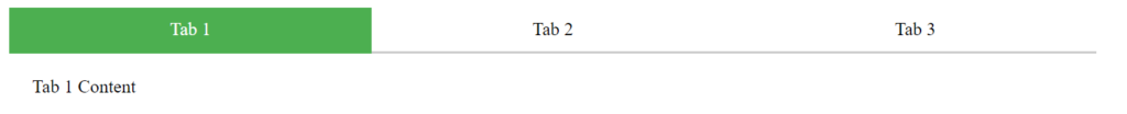
Copy and paste the CSS in the head section inside the <style> tag. Now open the HTML file the tabs will look like the below.
If you click on the tabs it won’t work because haven’t added the JavaScript click handler to the tabs yet. Now add handle the tabs click using below JavaScript code.
// Get all tab links and tab content elements

var tabLinks = document.querySelectorAll(".tab-links a");

var tabContent = document.querySelectorAll(".tab-content .tab");

// Add click event listener to each tab link

tabLinks.forEach(function(tabLink) {

tabLink.addEventListener("click", function(event) {

event.preventDefault();

// Get the target tab content element

var targetTab = document.querySelector(this.getAttribute("href"));

// Hide all tab content elements

tabContent.forEach(function(tab) {

tab.classList.remove("active");

});

// Remove the active class from all tab links

tabLinks.forEach(function(tabLink) {

tabLink.classList.remove("active");

});


// Show the target tab content element

targetTab.classList.add("active");


// Add the active class to the clicked tab link

this.classList.add("active");

});

});
Here, first I get all the tabs links and then add a click event listener to each tab link. The class “active” will be added to clicked tabs and removed from other tabs.
Copy and paste the JavaScript code before the body close tab and save the file.
Now open the HTML and test the tab functionality by clicking on each tab.
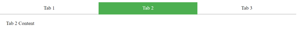
If you notice I have used the media query css to make the tabs responsive. Now toggle to mobile device view and the tabs are adjusted according to device width.
Conclusion
This is how you create responsive HTML tabs using JavaScript, HTML, and CSS. By switching the tabs you can show more information in less space.