In this article, I show you how to create a Fluent UI modal popup in Spfx react here I create one button in the web part, and on the button click the modal popup will open.

The fluent UI Modal control I have used for this demo. Let’s create one empty Spfx web part first using the below commands –
Step by Step Create Fluent UI modal popup in Spfx React
Step 1:
First, create one folder let say “MyModalPopup” in the file system using the below command –
md MyModalPopup
Now go to that “MyModalPopup” folder in the command prompt.
cd MyModalPopup
Step 2:
- Run the Yeoman SharePoint Generator command to create the spfx solution.
yo @microsoft/sharepoint
- Solution Name: Then selected the solution name let’s say “MyModalPopup” or type in any other name for your solution and Hit Enter.
- Environment: Then select the Target environment for this demo I am going to create this web part for SharePoint online(latest).
- Folder Option: Want to create the project in the same folder or create a new folder. Select the same folder.
- Deployment option: Y or N. Select N for now, to deploy only on a particular site, not all the sites.
- Require permission to access web APIs: Y or N option to Choose if the components in the solution require permission to access web APIs that are unique and not shared with other components in the tenant. Select N for now.
- Project Type: Client-side web part or an extension. Choose the web part option.
- Web part Name: Name the Web part let’s say “ModalPopup” and enter a description if you want and hit enter to proceed.
- Framework: No JavaScript Framework, React, and Knockout. Select React.
The Yeoman generator will start a scaffolding process to generate the spfx solution. it will take some time. As soon as the scaffolding process is completed, type “code .” And hit enter to lunch the created project in visual studio code.
Now the project is created let’s start the code to create a modal popup in spfx react.
Step 3:
First copy and paste the below CSS in the last of your “modalpopup.module.scss” file so that it looks ok when it opens you can change the same as per your requirement later.
.custommodalpopup{
font-family: Arial, Helvetica, sans-serif;
width: 640px;
height: 480px;
color:#000;
padding: 10px;
}
.closebtn{
position: absolute;
right: 0;
bottom: 0;
margin: 10px;
}
Step 4:
Create one file name IMyModalPopupState.ts under the src\webparts\components folder and create the below interface.
export interface IMyModalPopupState {
    openDialog: boolean;
  }
Step 5:
Below is the “ModalPopup.tsx” code kindly go through each line and merge the code piece in your web part and run the gulp serve command in the terminal.
import * as React from 'react';
import styles from './ModalPopup.module.scss';
import { IModalPopupProps } from './IModalPopupProps';
import { IMyModalPopupState } from './IMyModalPopupState';
import { escape } from '@microsoft/sp-lodash-subset';
import {
DefaultButton,
Modal
} from 'office-ui-fabric-react';


export default class ModalPopup extends React.Component<IModalPopupProps, IMyModalPopupState> {
constructor(props: IModalPopupProps) {
super(props);
this.state = {
openDialog: false,
}

}

private isModalOpen():boolean{
return this.state.openDialog;
}
public render(): React.ReactElement<IModalPopupProps> {
return (
<div className={styles.modalPopup }>
<DefaultButton text="Click Me" onClick={()=>this.setState({openDialog:true})}/>
<Modal isOpen={this.isModalOpen()} isBlocking={false} containerClassName={styles.custommodalpopup}>
<h3>My Modal Popup</h3>
<DefaultButton className={styles.closebtn} text="Close" onClick={()=>this.setState({openDialog:false})} />
</Modal>
</div>
);
}
}
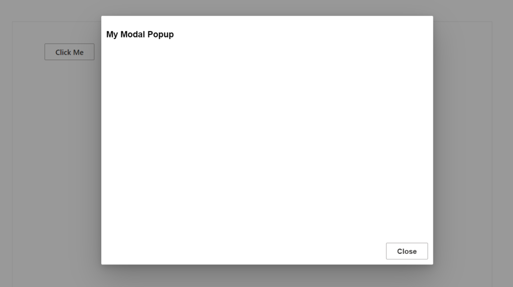
That’s it. When you click on the “Click Me” button in the Web part the modal popup will open and I have created one close button as well which is used to close the modal popup. Below is the expected output –
Conclusion
This is how you can create a Fluent UI modal popup in Spfx react. The CSS and the code you can change as your requirement.